top of page
UX/UI & Graphic Designer
Graphic Design
In this section, you will find a selection of graphic design projects developed both independently and in collaboration with companies. The work presented covers a wide range of disciplines, including branding, logo design, posters, flyers, business presentations...
 |  |
|---|---|
|  |
|
Logo for Sueña
Sueña is a studio dedicated to creating premium events, specializing in both fine food and drink experiences and wedding design and decor. For the identity, I wanted to blend that sophisticated side with the more sensory and vibrant aspect of celebrations. The isotype stems from a floral shape that subtly hides a crescent moon within its petals, nodding to botany, the night, and those special moments that linger. It is a clever visual play balanced by a high-personality typography and a vibrant pink gradient, reminiscent of the tones of a fine wine or a cocktail as well as the delicacy of floral arrangements, bringing freshness and warmth to a highly elegant brand.
 | |
|---|---|
 | |
Logo for AHOJ
The Ahoj Slovakia logo is structured around three key elements: Mount Kriváň (represented as a dark blue triangle with a leftward inclination, faithful to its real geographical shape), the orange circle symbolizing the diurnal cycle—sunrise and sunset—referring to the processes of beginning and closure inherent to Erasmus projects; and the blue dot at the summit, which acts as a human marker, indicating goal, presence, and connection. The sans-serif typography and the use of flat colors ensure legibility and scalability. The orange “A” within “AHOJ” highlights the greeting as the communicative axis, reinforcing the idea of welcome and institutional openness.
Logo for HoyAprendo
The HoyAprendo logo is structured around two fundamental concepts: the immediacy of learning and its modern, digital nature. Its central element is the lightning bolt, positioned in the upper-right corner of the typography, symbolizing speed, intellectual illumination, and instant access to knowledge—reflecting the essence of a free online course platform. The blue color of the lightning bolt conveys trust, technological reliability, and calm, encouraging continuous, stress-free learning. The word “HoyAprendo,” set in a clean, contemporary sans-serif typeface, emphasizes action in the present, reinforcing the value proposition of starting to learn immediately. Together, the name and the graphic symbol communicate an accessible, agile, and trustworthy identity, well suited to a modern digital educational environment.
 | |
|---|---|
 |  |
 | |
 |
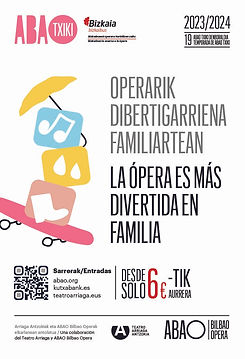

Flyer ABAO TXIKI
(Ópera de Bilbao)
This flyer was designed to capture the playful and educational essence of ABAO TXIKI, blending functional clarity with visual appeal for a family audience. The cover synthesizes the four operas into a cohesive image that invites exploration, while the interior organizes information with a vibrant palette and a clear bilingual structure, ensuring that every detail—from dates to educational values—is both accessible and engaging. Each choice of color, typography, and layout aims to convey that opera, even for the youngest audiences, is a living, diverse, and magical experience.
Some Other Posters Here


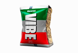
VIBE Packaging
The project includes the development of several packaging designs for the same brand, applied to different containers and formats—such as a pasta package, a beverage can, and a flavor sachet—to demonstrate the adaptability and coherence of the visual identity.
 |  |
|---|
Social Media Content: Instagram Example


1/1
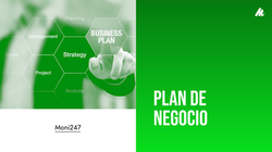
Presentation Design
Design of professional presentations for business plans, brand guidelines, and corporate communications.
 |
|---|
 |
 |
 |
 |
 |
 |
 |
bottom of page